

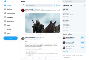
Twitter has a new, simpler design
 Microblogging service – or perhaps after increase in character limit, miniblogging service – Twitter has redesigned its user interface, and released it to the public.
The new design is trying to make it easier to use the service and its core features. This means that the navigation has been updated, and it should be easier to access things like your notifications, messages, and trends.
The site still relies in the three column view in which the center column is dedicated to your Twitter feed. However, Trends for you has moved from the left side to the right side, and now takes up the space above Who to follow, which is still at the bottom right.
Navigation has been moved from the top to left side and takes up way more of the real estate. The navigation bar includes the following options: Home, Explore, Notifications, Messages, Bookmarks, Lists, Profile, and More.
More gets you to less used features, like settings, ads, analytics and so forth.
A new Tweet button can be found under the navigation menu and the tweet field is still at top center like you're used to.
All the elements are far larger, and the design is much simpler, easier to read, and perhaps to use. It might be a little too simple for some, but on the other hand it does now offer two different dark modes.
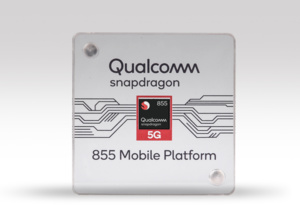 The leading chip manufacturer for Android phones has released a new system-on-chip. Qualcomm's new offering is called Snapdragon 855+ and it improves upon their flagship model with better performance.
 Aptoide has removed two Android apps that are used to watch TV shows and movies for free from the market following a lawsuit two film companies.